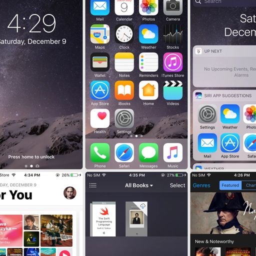
What iOS 10 looked like
If you suddenly feel like experiencing nostalgia or talking about how things used to be better, this post is a perfect opportunity.
If you suddenly feel like experiencing nostalgia or talking about how things used to be better, this post is a perfect opportunity.
Once, on a master, I had this annoying click in just one spot. It showed up because of a mess of automations, special effects, unlucky layering of everything imaginable, and the piano sample had a super short attack that made it kind of "pop".
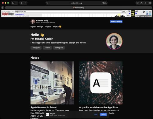
Wow! You're now looking at the updated design of my personal website™! I haven't changed anything here in a long time. Thanks, as always, to Timur for helping with a bit of redesign.
I can barely remember the last time I actually drew or designed a cover, instead of just using a photo with a logo. Maybe around ten years ago. Usually, covers are supposed to show the title and the artist's name, but whenever I try that it just looks boring.
It seems I've figured out what the design transition between iOS 6 and iOS 7 felt like. The only difference now is that there isn't a global paradigm shift, there's no need to remove shadows and textures and replace them with solid colors.
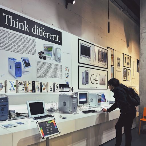
It's the largest in the World. There are more than 1600 exhibits related to the history of Apple. Do you know about Apple printers or cameras?
Развитие интерфейсов в мессенджерах пошло куда-то не туда. Про самую большую проблему и компромиссное решение.
Анимации - это весело и красиво. Совет про то, как не испортить их восприятие.
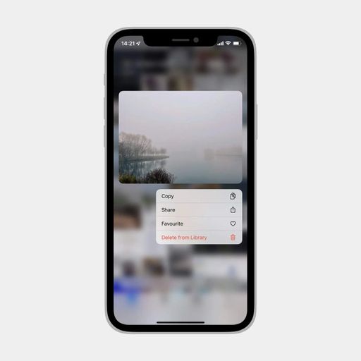
Контекстные меню подталкивают дизайнеров и разработчиков к тому, чтобы сбросить в них весь мусор в унифицированном виде, а интерфейс оставить чистым. Так лучше не делать.