It seems I’ve figured out what the design transition between iOS 6 and iOS 7 felt like. The only difference now is that there isn’t a global paradigm shift, there’s no need to remove shadows and textures and replace them with solid colors. And I think that’s where the big problem will be.
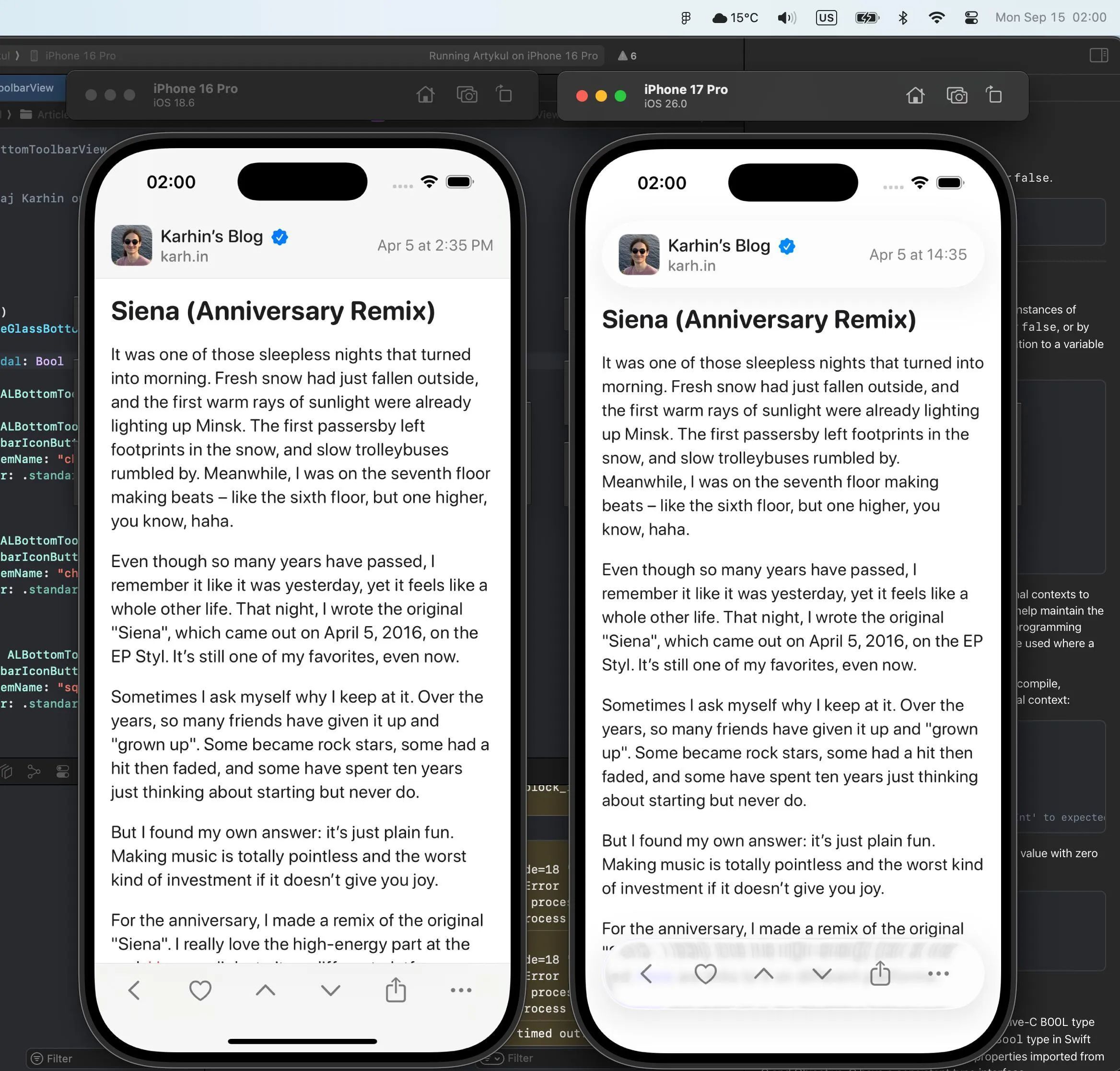
If you want to do it properly and care about backward compatibility, you still have to duplicate and rework all components for the new iOS version. Glass design, after all, implies turning pretty much all major interactive elements into cards and circles. There are no longer components that blend into the edges of the screen (mainly navigation elements).
Old components were easy to create yourself because of the minimalism. With the new design it’s no longer such a simple task because of all the tricky special effects.
If it’s a non-native app, achieving the glass effect and a “native” feel will be a very difficult task. In some cases, impossible.
So it turns out that nothing has really changed globally, and there’s very little point in reworking anything, especially considering how hard it’s to support both the old and the new. Particularly in a situation where development and design are being done on a tight budget.
I have a bad feeling that most apps will stay in their current design for a very, very long time.


Comments
To post a comment, please log in or create an account.
Sign In