I can barely remember the last time I actually drew or designed a cover, instead of just using a photo with a logo. Maybe around ten years ago.
Usually, covers are supposed to show the title and the artist’s name, but whenever I try that it just looks boring. So I’ve been sticking to only using the logo. To be honest, most covers these days look boring anyway. And it got even worse once people started making them with ChatGPT. You can tell right away, and it feels kind of cheap.
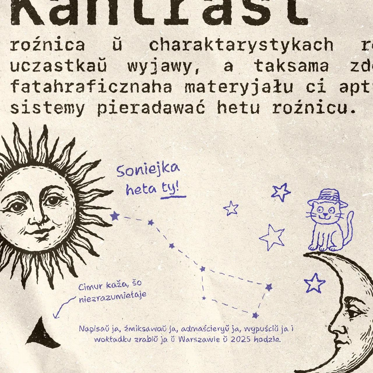
This time I wanted to make something fun. A cover you can look at for a bit longer and actually read. Some people might say “who even reads that stuff”? Well, that’s exactly the point! I wrote it in Belarusian Latin, so only a few people could even read it. And maybe they’ll smile, the same way I did when I came up with it. It would also be cool if someone from another country and culture decided to find out what’s actually written here and what language it is! I like things like this, little puzzles. If I enjoy them, then someone else out there in the world will find them fun too 😁
Of course I should also add that more people from Australia or Indonesia listen to my music than from Belarus. Sometimes I think about that and it makes me a little sad. What do you even call it when you feel like you “don’t care”, but at the same time it still kind of hurts? Ah, whatever, screw it.
Here are some covers I made almost ten years ago (2015-2016). A bit naive in places, but fun to remember.
It seems I’ve figured out what the design transition between iOS 6 and iOS 7 felt like. The only difference now is that there isn’t a global paradigm shift, there’s no need to remove shadows and textures and replace them with solid colors. And I think that’s where the big problem will be.
The end of an era
If you want to do it properly and care about backward compatibility, you still have to duplicate and rework all components for the new iOS version. Glass design, after all, implies turning pretty much all major interactive elements into cards and circles. There are no longer components that blend into the edges of the screen (mainly navigation elements).
Old components were easy to create yourself because of the minimalism. With the new design it’s no longer such a simple task because of all the tricky special effects.
If it’s a non-native app, achieving the glass effect and a “native” feel will be a very difficult task. In some cases, impossible.
So it turns out that nothing has really changed globally, and there’s very little point in reworking anything, especially considering how hard it’s to support both the old and the new. Particularly in a situation where development and design are being done on a tight budget.
I have a bad feeling that most apps will stay in their current design for a very, very long time.
Various fringe voices and other interested parties love to claim that GPT models will soon replace everyone. But fortunately or unfortunately, these models don’t actually create knowledge. People do, based on their own experience. The models just learn from what already exists.
If you’ve ever programmed in a less popular language, like Swift, you know that GPT models often can’t solve even half of the basic problems beyond “Hello, World” or basic UI layout. And when it comes to more specialized fields, like embedded systems, forget it.
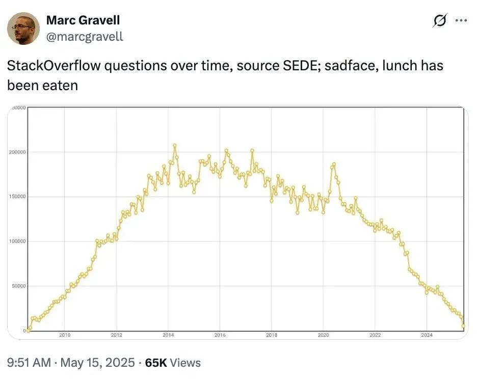
If platforms like StackOverflow and others that generate real knowledge disappear, we’ll eventually end up with neither good GPT models, nor StackOverflow, nor real human expertise.
Most developers, who enjoy riding hoverboards, will find themselves back in a world where you can’t find answers on Google, ChatGPT, or StackOverflow. At this rate, a lot of people really could lose their jobs, unless they start thinking for themselves.
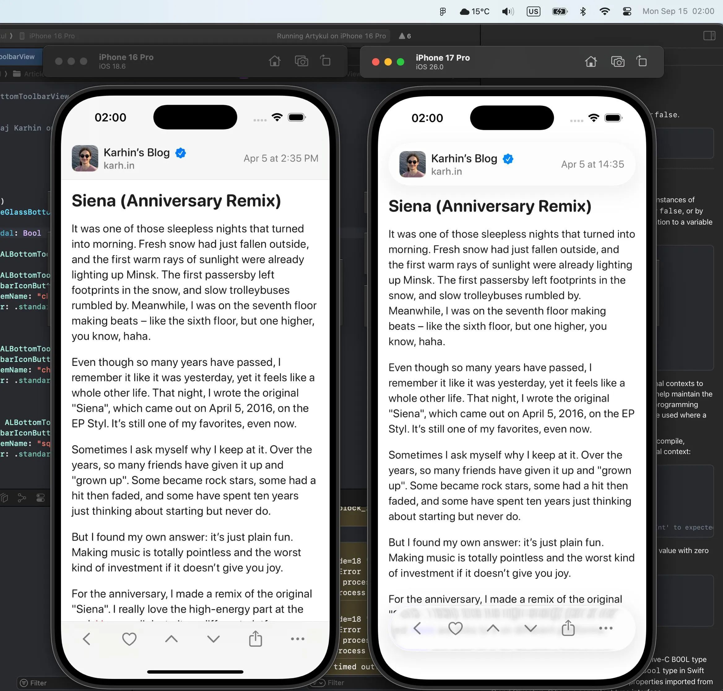
It was one of those sleepless nights that turned into morning. Fresh snow had just fallen outside, and the first warm rays of sunlight were already lighting up Minsk. The first passersby left footprints in the snow, and slow trolleybuses rumbled by. Meanwhile, I was on the seventh floor making beats – like the sixth floor, but one higher, you know, haha.
Even though so many years have passed, I remember it like it was yesterday, yet it feels like a whole other life. That night, I wrote the original “Siena”, which came out on April 5, 2016, on the EP Styl. It’s still one of my favorites, even now.
Sometimes I ask myself why I keep at it. Over the years, so many friends have given it up and “grown up”. Some became rock stars, some had a hit then faded, and some have spent ten years just thinking about starting but never do.
But I found my own answer: it’s just plain fun. Making music is totally pointless and the worst kind of investment if it doesn’t give you joy.
For the anniversary, I made a remix of the original “Siena”. I really love the high-energy part at the end. Here are links to it on different platforms.
My new track is already on all platforms. I made a visualizer for this track, which you can watch above. If you just want to listen to the track, here are links to it on different platforms.